Efe Obada Foundation · Brand story
Two Roots, One Letter
One letter that carries both of Efe's homes and the game Efe found along the way. That letter is the Y.
a brand story by Naz
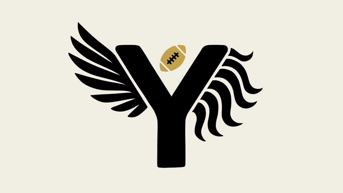
I designed this identity for the Efe Obada Foundation, which supports children in the care system. I admire what it stands for: paying it forward and being a role model to young people. Efe's NFL London Games Ring of Honour induction and the journey behind it shaped much of this work.
Efe and I share Nigerian roots and ties to Britain, and football has been part of both our journeys in the US and Europe, at very different levels.
This is the work I made for the foundation: the mark, the seal, the name plates, and a tee with a front and a back. Every element has a reason, and this page explains each one.
- For
- Efe Obada and the Efe Obada Foundation
- Status
- Final art
The idea
The story in one minute
The foundation's line is "Architect of My Destiny", and it supports children in the care system by helping transform young lives. I built the storyboard and every design from those two facts, while capturing Efe's journey.
Two homes
Efe was born in Nigeria, lived in the Netherlands, and grew up in Britain. I put the emphasis on Nigeria and Britain. The mark does not choose between these places. It takes one symbol from each, an eagle for Nigeria and a lion for Britain, and puts them on one letter.
One thing chosen
Efe found and chose football at 22. That is why the football in the mark is small, gold and set apart. I feel the other parts of the journey were set or shaped by circumstance.
An architect's drawing
The tee back turns the tagline into a visual analogy. A crane lowers the last letter of DESTINY into place, and that letter is the Y from the mark. The final piece of the destiny Efe built is the mark itself.
The mark
The Y, the wing, the mane, the ball, and the colors and type around them
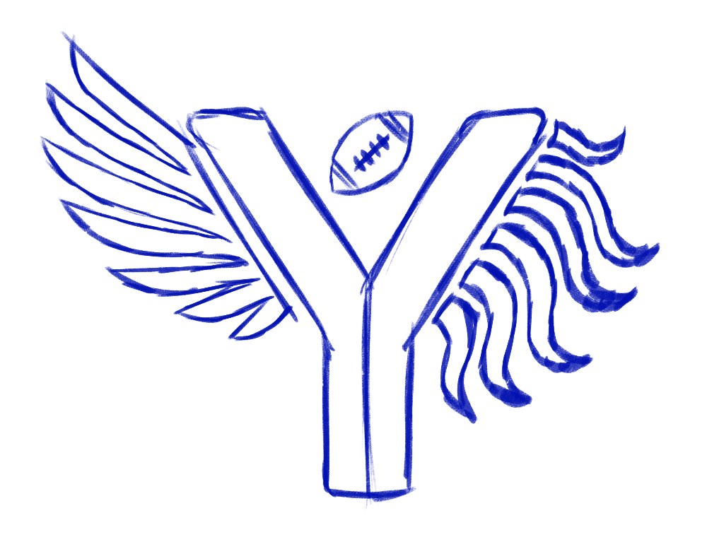 12345
12345- 1
The Y
What you see: a heavy block Y with a clean fork.
- Why I used it
- The Y comes straight from Nigeria's coat of arms, where it stands for the Niger and Benue rivers meeting. I liked that a letter could be a river junction, so Nigeria is in the mark without needing a flag.
- What it says
- Two rivers meet and become one. That is Efe: two places in one person. The fork is also a point where anyone chooses a direction, which fits a foundation that supports children in care.
- Where it came from
- The coat of arms and the map of the rivers. I made the shape thick, like a jersey number, so it holds up on a T shirt chest or a cap.
- 2
The Eagle Wing
What you see: six long pointed feathers sweeping up and out of the left arm.
- Why I used it
- An eagle stands at the top of Nigeria's coat of arms, so the wing on the left arm represents Nigeria.
- What it says
- Strength, sight and rising. The feathers lift up and away from the letter, so it reads as taking off and not as decoration. Everything Efe has built rose from where it began.
- Where it came from
- The eagle on the coat of arms. I kept the feathers long and swept back so they suggest flight, a nod to the journey across countries.
- 3
The Lion Mane
What you see: seven wavy, S shaped locks, longer toward the bottom.
- Why I used it
- A lion is a central figure on the British royal coat of arms, so the mane on the right arm represents Britain.
- What it says
- Courage and pride. The wing lifts while the mane flows down and out, so the two sides balance each other. I curled the tips so it cannot be mistaken for antlers or flames.
- Where it came from
- The heraldic lion and a real mane in motion.
- 4
The Football
What you see: a small laced football floating in the V.
- Why I used it
- It sits where the two arms meet, so it is what Nigeria and Britain produced together. Efe found football at 22, so I kept it small and set apart instead of making it a big badge.
- What it says
- Everything else in the mark comes from where Efe is from. The ball is the one thing Efe chose. I tilted it so it looks thrown or just caught.
- Where it came from
- A single laced football is the clearest football symbol and stays readable when small. It also keeps the mark free of any NFL shield or league shape.
- 5
The Split Stem
What you see: a center line running down the stem.
- Why I used it
- A line down the middle lets the colored versions use two colors in one letter, like a split flag.
- What it says
- Two homes, one body. Both halves are the same size, so neither country sits above the other. The stem is also the base everything stands on, which ties into the foundation idea.
- Where it came from
- The green, white and green vertical stripes of the Nigerian flag.
Color
Four colors, and each one has a job
My sketch is a single blue line, so this is where I explain the final colors. I avoided NFL blue and anything that looks like a league logo on purpose.
The ground, and the mane on light. Stadium at night and fresh ink. It makes the green and bone glow, works on black tees, and carries the mane on light backgrounds.
The mane and the second half. A warm white that echoes the white stripe of the Nigerian flag.
The wing and the first half. Straight from the Nigerian flag. It is the home color and the strongest one in the mark.
The football only. The one thing found by choice. It also nods to the NFL London Games Ring of Honour induction.
The gold rule. Gold stays around 5% and never touches the wing, the mane or the stem. Because it appears only once, the eye goes to the football first. I also never use more than three colors on one piece.
Type
The words that sit with the mark
The sketch has no text yet. Here is what goes beside it and why it was chosen.
Big Shoulders Display. Tall, narrow and heavy, like the numbers on a jersey. You can read it from far away, and it feels like sport.
Inter. Plain and calm. Wide spacing lets the tagline sit quietly under a loud mark.
Efe's own handwriting. For the final version, I would like to use a traced scan of Efe's real handwriting. The font shown is only a placeholder.
The finished mark
One drawing, four colorways
Now it is inked and colored. The drawing never changes. Only the colors do, depending on the background.
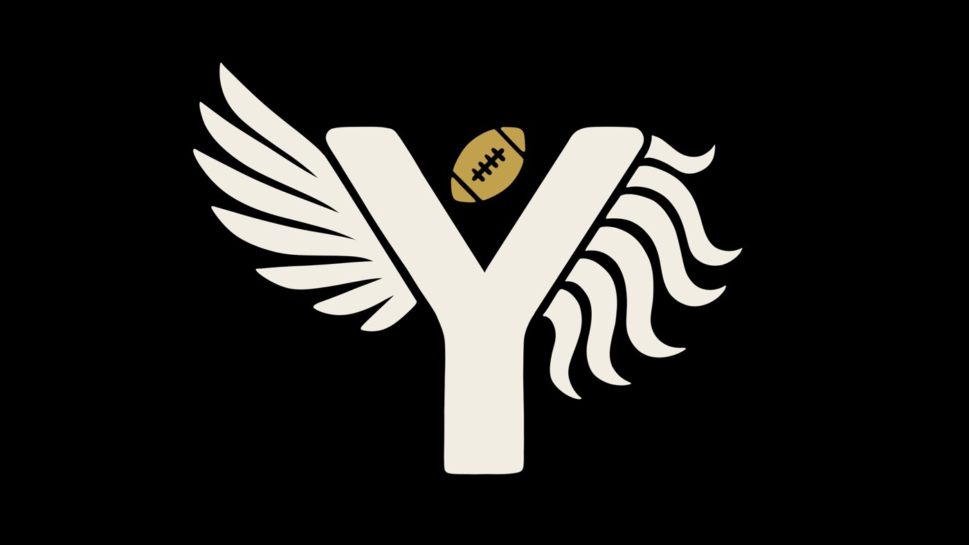
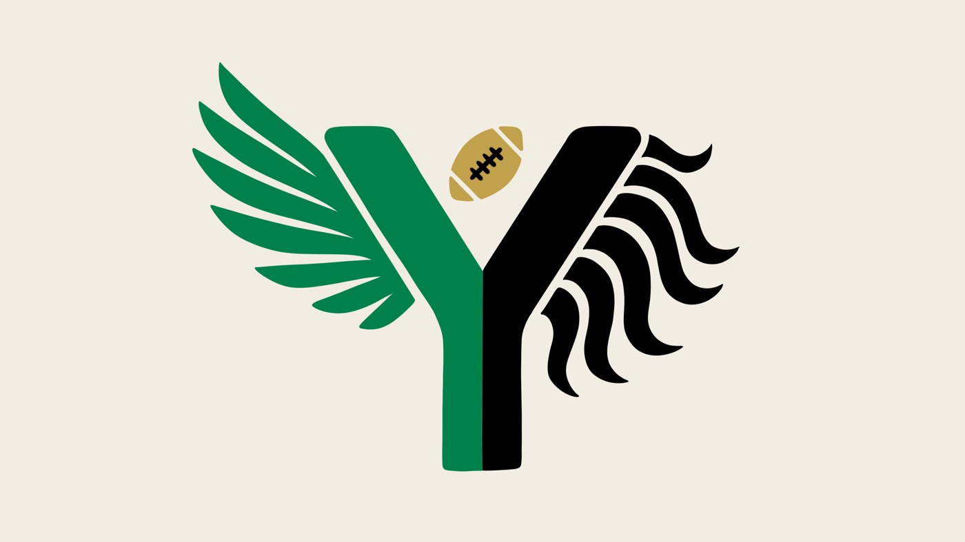
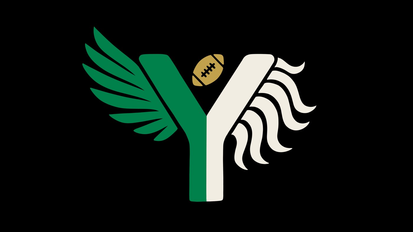
How the colors switch. Nigeria stays green on every version that has color. Britain switches between Night and Bone so it always has contrast with the background. The football stays gold with Night laces, so the one gold thing never moves. I never put Bone on white because it disappears.
Sketch to final
What changed from my sketch
The sketch already had the whole idea. This is what changed when I inked and colored it.
The roundel
The seal
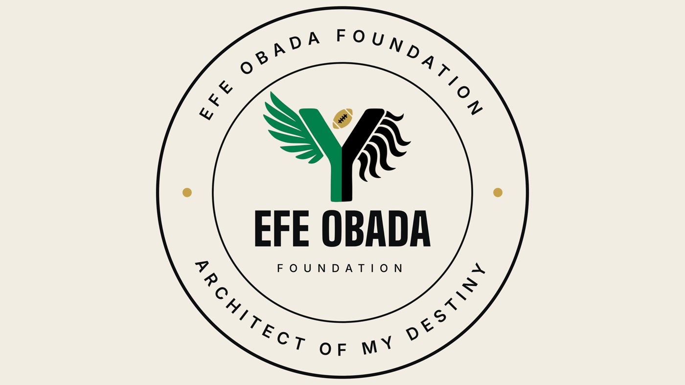
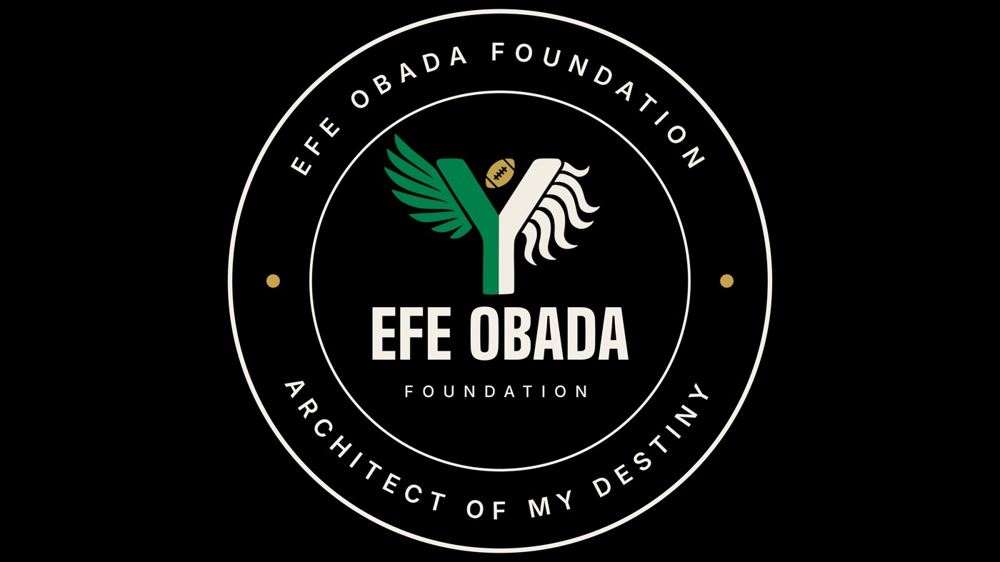
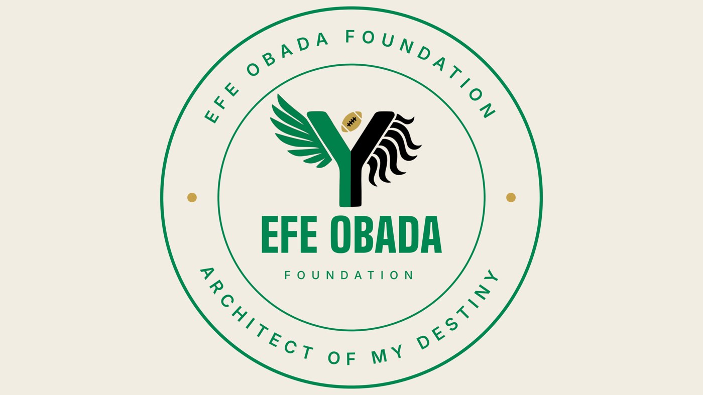
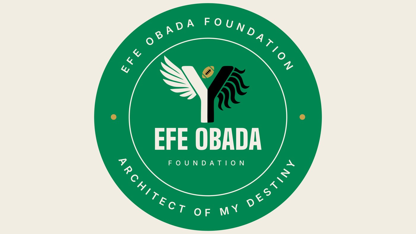
The roundel is the mark turned into a stamp. I made it for places where a logo has to act like a badge: a left chest embroidery, a cap, a sticker, a profile picture.
- a
The ring text
- What it is
- EFE OBADA FOUNDATION across the top and ARCHITECT OF MY DESTINY along the bottom. Both lines read left to right and sit right side up, so nothing is upside down.
- Why I did it
- The top says who. The bottom says what the foundation stands for. The tagline is the foundation's, and it sits closest to the ground.
- Where it came from
- Notary stamps, workshop marks and college seals. A circle feels official, and you can stitch it, press it or stamp it.
- b
The two rings
- What it is
- A heavier outer ring and a thin inner ring, with the text in the band between them.
- What it says
- The outer ring is the boundary wall and the inner ring marks the plot the mark stands on. I borrowed this from site plans, which connects to the architect idea on the back of the tee.
- c
The gold dots
- What it is
- Two small gold dots at the left and right edges of the ring.
- What it says
- One sits on the wing side and one on the mane side, so they stand for the two homes. They also split the top text from the bottom text.
- Why gold
- They follow my gold rule. Gold stays small and rare, the same weight as the football, so the roundel never turns into a gold badge.
- d
The center
- What it is
- The mark sits on top, with EFE OBADA in heavy type under it and FOUNDATION in spaced out Inter below that.
- Why I did it
- The mark is the crest and the name is the signature under it. The ring text becomes too small to read at tiny sizes, so the center name stays short and strong.
- e
Why the mark changes on green
- What I did
- On the filled green roundel the wing and left stem turn Bone, the mane and right stem turn Night, and the football stays Gold.
- Why
- A green wing on a green disc would disappear. Flipping it keeps the split readable while the disc itself carries the Nigerian green.
The lockups
Name, mark and tagline, three ways
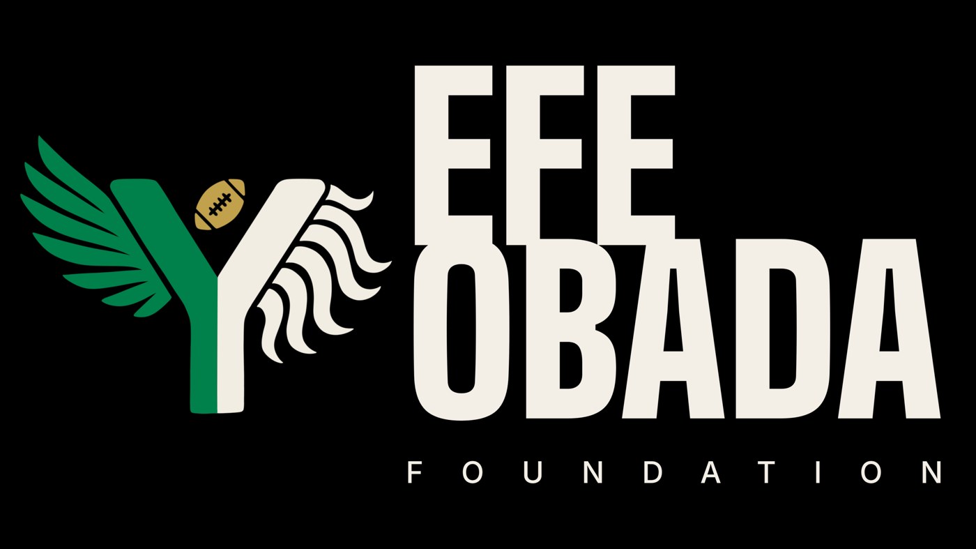
A lockup locks the pieces together so nobody has to rebuild them each time. Each one comes in a version for light backgrounds and one for dark.
- L1
Stacked
- How it's built
- Mark on top, EFE OBADA in the heaviest weight, FOUNDATION stretched to exactly the same width, a short gold rule, then the tagline.
- Why I did it
- Matching the widths makes it one solid block, like a plaque. The name is loud, FOUNDATION is quieter and the tagline is quietest, so the order is clear at a glance.
- Where to use it
- Covers, posters, letterheads and the top of a page.
- L2
Horizontal with mark
- How it's built
- Mark on the left, the name split into EFE above OBADA, and FOUNDATION spaced out underneath to match the width of OBADA.
- Why I did it
- Splitting the name lets the type match the height of the mark, so they read as one unit instead of a logo sitting next to a caption.
- Where to use it
- Website headers, email signatures and banners, anywhere the space is wide and short.
- L3
Text only
- How it's built
- EFE OBADA on one line, a thin gold divider, and FOUNDATION over the tagline on the right.
- Why I did it
- Some places already have the mark nearby or have no room for it, like a name tape, a footer or a sponsor line. This keeps the typeface and the gold detail without repeating the mark.
- The gold
- The divider and the rule in the stacked lockup are the only gold in the lockups. They are a small echo of the football.
The tee front
Quiet on the front, loud on the back
The front carries one small thing and nothing else. That keeps the back as the statement and lets the front work as a clean, wearable shirt. I made two options. Pick one, not both.
- a
Why the roundel
- The reason
- A left chest seal is the oldest place for a team or club badge. It tells people who made or backs the shirt without shouting, and it never competes with the back.
- The detail
- At 3.5 inches the ring text is still readable up close, and the mark in the center is readable from across a room.
- b
Why the horizontal lockup
- The reason
- Some people will want the name on the front. The horizontal lockup puts the mark and the name together at a size that works in photos.
- The detail
- Everything on the front stays in the brand colors, and I keep clear space around it equal to the width of the football. No NFL marks or league logos appear anywhere.
- c
Colors on the front
- Black tee
- Roundel R2 or lockup L2 in Bone, with the Naija Green wing and the gold football.
- White tee
- Roundel R1 or lockup L2 for light backgrounds, in Night with the Naija Green wing and the gold football.
The tee back
Project Destiny, drawn like a blueprint
The back is a full graphic made as an architect's drawing sheet. The tagline is the headline, the picture is a building site, and the story is built into the wall. Below is the finished board, then each piece explained in the order I would read it.
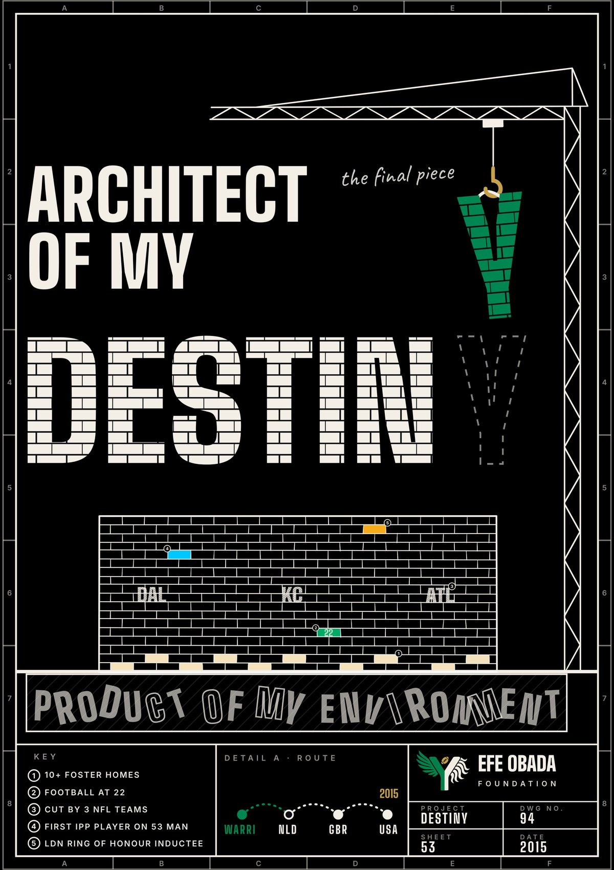
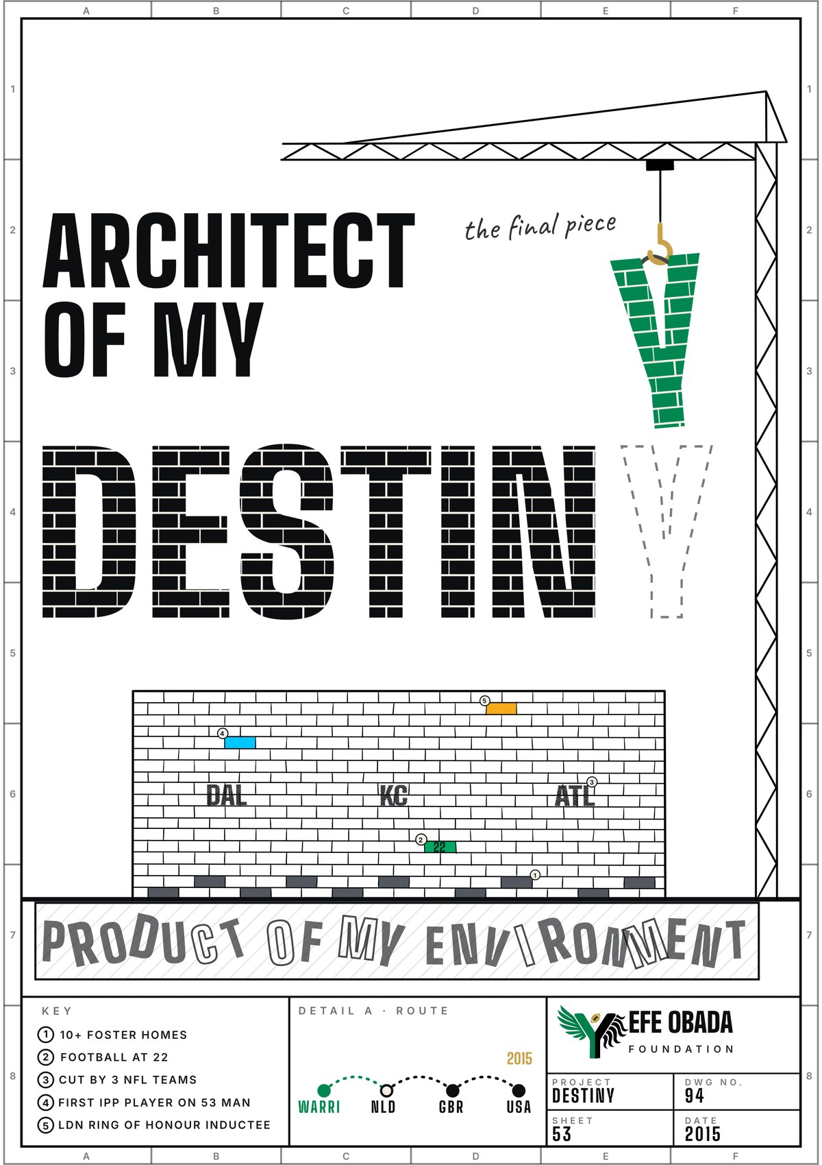
How to read it. Start at the headline, follow the crane down to the open slot, then look at the wall and its numbered bricks, then the slab it stands on, and finish with the key and the title block along the bottom. The story runs from the idea down to the ground it was built from.
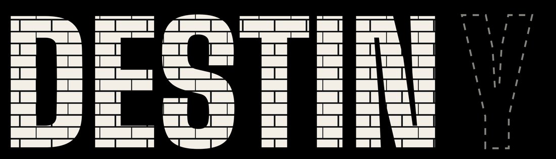
The headline and the missing letter
- What you see
- ARCHITECT OF MY in solid type, then DESTIN built out of bricks, and an empty dashed outline where the last letter belongs.
- What it says
- The foundation's tagline is Architect of My Destiny. I show it literally. Destiny is being built, brick by brick, and it is not finished yet. One piece is still in the air.
- Why bricks
- Brick is the material of the wall below and of the foundation idea. A word made of bricks reads as something built, which is the whole point of the line.
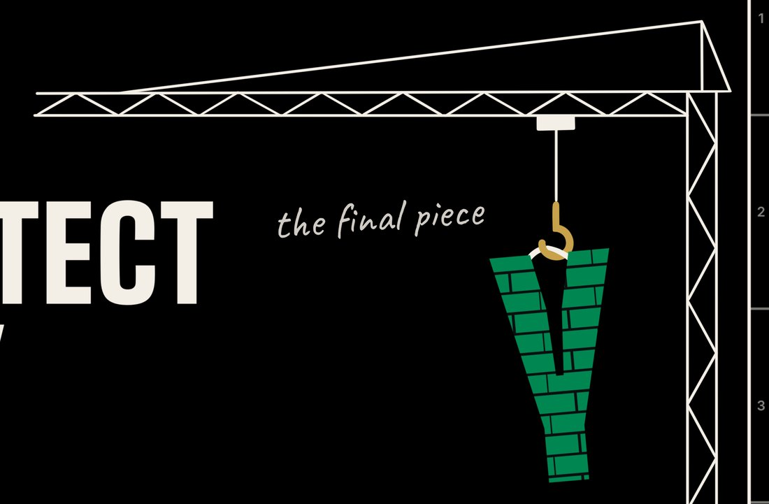
The crane and the Y
- What you see
- A tower crane lowering a green Y made of bricks, with the handwritten note "the final piece" beside it.
- What it says
- The last letter of DESTINY is the Y from the mark, in Naija Green. The one letter that holds both homes completes the word. The mark is not stamped on the shirt as an extra. It finishes the sentence.
- The note
- The handwriting is an architect's markup on a drawing. In the final version I would like to replace it with Efe's real handwriting, traced from a scan.
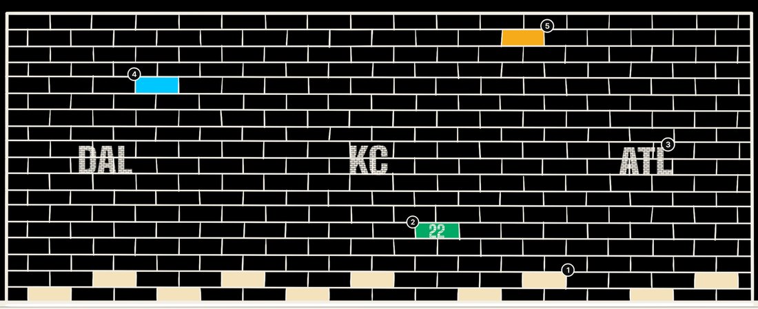
The wall and its numbered bricks
- What you see
- A long brick wall. Five small numbered markers point to bricks that tell Efe's story, the way a blueprint marks the details that matter.
- What it says
- The wall is Efe's career and life, built one course at a time. The numbers match the key at the bottom of the sheet.
- The initials
- DAL, KC and ATL are stamped into the wall as initials. They stand for the Dallas Cowboys, the Kansas City Chiefs and the Atlanta Falcons, the three teams that released Efe before the breakthrough. Each setback is now part of the structure.

The foundation slab
- What you see
- A hatched concrete slab under the wall, with the words PRODUCT OF MY ENVIRONMENT in uneven, tumbled letters.
- What it says
- Where Efe started is the ground everything stands on. The letters are rough and mismatched, like broken material used as a footing, yet the whole wall rests on it and does not move.
- Why I did it this way
- I did not want it to read as pity. It reads as material. This is what the wall was built from, and it is part of why the wall is strong.
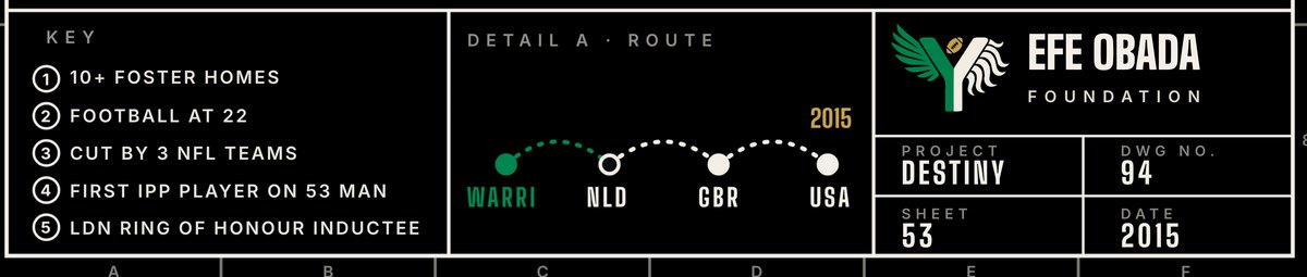
The key, the route and the title block
- The key
- Five short lines, numbered to match the bricks. They are explained in full below.
- Detail A, the route
- A dotted line from WARRI to NLD to GBR to USA, the Nigeria, Netherlands, Britain and America Efe has lived in. WARRI is in green, because it is home. The year 2015 is marked in gold, the year the first NFL contract began.
- The title block
- Every real drawing has one. Mine shows the mark, EFE OBADA FOUNDATION, and PROJECT DESTINY. DWG NO. 94 is the jersey number Efe wore. SHEET 53 is the 53 man roster Efe broke through to. DATE 2015 is the year the NFL path began.
Built to go straight to a screen printer
These are the numbers I used so the back fits a normal shirt and the files hold up at full size.
3600 × 5100 pixels at 300 PPI. The ratio matches the drawing, so nothing is stretched.
A standard back print runs 12 to 14 inches wide and 16 to 18 inches tall. If a printer's frame is 12 × 16 inches, scale the whole file down evenly to about 11.3 × 16 inches.
Center the board on the shirt, starting about three inches below the neck seam.
The black on the dark board is the shirt, so the print file has a clear background. Separate files exist for every text piece, the empty blueprint, and every element.
The brand inks on a Night tee. The two accent bricks, numbers 4 and 5, are extra colors. If the printer charges by the ink, they can print in Gold and Bone instead.
Use the white board. Gold prints lighter on white, so for white tees only I can use a deeper gold, #9A7A2B.
One test before a full run. The brick texture has fine mortar lines. Print one sample at full size first. If the lines fill in, I open them up to 1.5 point and resend the file.
Quick guide
Which version goes where
These are my suggestions as a starting point. A team can pick its own primary versions.